[Work created as a group]
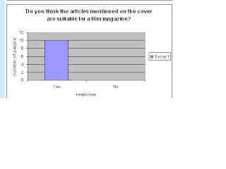
We asked equal amounts of males and females (10 for each) and age ranges (10 for 13 - 15 and 10 for 16 - 19). This made sure we gained reliable results from our 20 questionnaires we handed out. The point of this was to gain feedback from our chosen target audience to see if our product would appeal to them and fitted in with our chosen Romantic Comedy genre. Overall, as proven below by our set of results, our trailer was suitable to our chosen target audience!
Wednesday, 24 February 2010
Wednesday, 10 February 2010
'Soul Switch' Trailer
This is our Romantic Comedy trailer called 'Soul Switch'. It can be found on the following link:
http://www.youtube.com/watch?v=eLOdVWJkZME
What changes i made to my magazine cover and poster drafts and why
[work done by me]
Magazine cover
I changed the pink background in my first draft to a blue background in my second draft. This was so that i could see how different colours would look behind the fonts i wanted to use and the image. I also change the layout. I changed the main headline from being in the middle of the far right on my first draft to the centre so that it was placed in the primary optical area and was clearer for the audience to see. I also decided the order of the other headlines looked messy on the page and therefore changed them in my second draft so that they covered more of the page and were also clearer to the reader. I decided i liked the pink background better than the blue as it refered to my target audience more and the genre of the film better. it also refered to the actors genders on the cover. Using the layout from my second draft and the background from my first draft, i was able to create my final draft. The only thing that was different on this was the heart shaped box in the left hand corner. This was to imply to readers more about the 'chick flick' issue, the heart being a more girly shape.
Poster
In the first draft of my poster i used a white background but decided this looked too plain for a poster and wouldn't get my audience's attention so well compared with if i used more colour. I used the background from the photo i had taken to make the poster seem more busy and apealing to the reader. I also decided to move the title of the film down into the primary optical area in my second draft as it would stand out more to the audience and they would have more chance of remembering the title. I moved the actors names around a bit in my second draft so that it looked as if they were printed on the lockers to symbolise school life and where the teenage actors spend alot of their time. By the time i'd come up with my final draft, i had decided to make my tagline much bigger so that my audience had more chance of seeing it comapred to the previous two drafts. I kept the title of the film in the middle along with the image of the actors. I changed image once again to show clearly the geeky character and the popular character and i thought this picture particularly best presented that. i used a pink background again to match my poster and felt it referred to the main characters in the film's gender, it being a girly colour. The bold coloured background would be more likely to get my target audience's attention. Finally, i had chosen to add a reviewer's comment and a 'from the makers of..' to give the audience an impression about the film - how good it was and who had made the film. The audience would then take this into consideration and want to see the film.
Tuesday, 9 February 2010
Subscribe to:
Posts (Atom)